

What would our creative lives be like void of color? Color is an important part of human expression. It effects how we sleep, relax, react, romance and even effects our appetite. Color for me is the equivalent to music. I could not live without one or the other. Both are my vehicle to
"The best color in the whole world, is the one that looks good, on you!” - Coco Chanel
"The purest and most thoughtful minds are those which love color the most" - William Ruskin
How does color effect your life?

One of my favorite blogs for collections of color that inspire me - Creative Holly Color

"Kaufman & his partner Taffy Dahl, produce the richest,
& most refelective paints out there" - House & Garden

 Donald Kaufman Color Paint
A pioneer in the field of Architectural color, Donald Kaufman Color creates unique palates and special pigment formulations based on thirty years of experience based on the equation of color +space+light. Architectural color is nothing less than the medium through which we experience the architecture. It is more than mere decoration. It is more concerned with light and dark, than yellow, red, and blue. It can create or destroy the harmony and balance of the spaces. DKC's collaborations with every stylistic persuasion, and with equally brilliant colorists of amatur status, have been behind the creation of every Color Collection color. All DKC employ precise proportions of paired compliments across the spectrum.
Fine tuned color -unlike commercial paints, made by a rigid system, each DKC pigment recipe is unique and includes their own exclusive ingredients, combined according to the color's special character. How to buy information, including online, & more, search here.
**note:I was not able to find any information on DKC's website if this paint was void or low of harmful VOC's.

"Color can extend walls, raise ceilings & eliminate corners" - Donald Kaufman

"All that is needed to create a luminous atomosphere, is the interplay
of warm & cool, sunshine & shadow" - Donald Kaufman


Until now I thought Krylon had the best color options for my crazy dreamt up projects. Well dream big with Montana Gold and it's 182 line-up of radiant colors. Perfect for both indoor and outdoor use, and suitable for numerous surfaces. Lead and CFC-free quality paint made in Germany, that you can count on. Many other Montana paints available and for more detailed information if this paint is appropriate for your next project, read here. Purchase online @ dickblick.com.


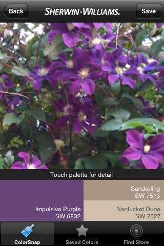
Not another iphone app? - I'll let you decide if this is worth adding to your app line-up or better yet, take the leap to buy the iphone. "Color Snap" is a new tool brought to us by Sherwin Williams Paints. This is the scenario - you are vacation in Barcelona and you spot a red on a matador's cap that you would love to paint your front door. Simply snap a photo of the said subject and the application searches SW's 1,500 paint options. Within seconds, a strip of colors appear with the closest match highlighted. Download the free application here. Benjamin Moore Paints with a larger selection of 3,300 paints has their version available here.

{go forth & shop responsibly}
express yourself
photo credits; fallingintopolkadots.photobucket;rebeccawarddesign.blogspot; kitchenresidentialdesign.com; peakofchic.blogspot; elledecor.com;
6 comments:
Color me a color freak!! Love this post!
Great fun! If only that SW application worked on my BB bold. :/
I'm not averse to colour but I tend to subscibe to the 'sludgy' group of colours...I wear black , white and grey with splashes of colour and tend to be similar when decorating..using creams and neutrals. Although I do lots of posts on white, my home isn't white. It is cream with moments of duck egg blue , and various neutrals and then, suddenly, a splash of something vivid....someone once said to me that if you don't wear colour, you must be a miserable person...not true and I am testement to it !!!!!
One of my favorite ways to get inspired is to check out the latest pantone fashion color report. The combos are always so fresh and perfectly set the tone of a room.
I am certainly fascinated by colour and it's impact on your emotional body. Whenever I am feeling sluggish I wear red lipstick. Even If I don't feel it myself ppl tend to comment that I look bright and cheerful!! [fake it till you make it]. I have to say I tend to use blues and green accents at home as I find it is relaxing. Yellow is a mentally stimulating colour and therefore not a great idea for me [my mind is always racing anyway]!! Great post Deb.
Isn't that montana paint awesome? I discovered it last Summer ay my art store - I cannot believe all the beautiful colors that are available. Have a great wknd!
Post a Comment